CSS3快速弄明白border-image
Updated:
Contents
【转】原创作品,允许转载。转载时请务必以超链接形式标明文章原始出处、作者信息和本声明,否则将追究法律责任。
http://www.cnblogs.com/niuniu/archive/2010/06/21/1761803.html
在看这个属性时,好像国内的文章都没给大家说太明白,今天就一起说说
首先来一个素材图片whiteButton.png
然后我们要做成这样的效果:
|
|
下面我们来讲一下基本知识:
定义: border-image : none |
none 默认值。无背景图。<image> 使用绝对或相对 url 地址指定背景图像。<number> 边框宽度用固定像素值表示。<percentage> 边框宽度用百分比表示。[ stretch | repeat | round ] 拉伸 | 重复 | 平铺 (其中stretch是默认值。)
请看下图平剖析一下css代码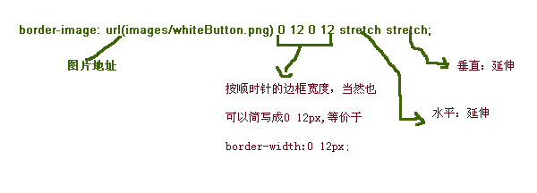
也就是: 他们把图片,用#的方式截取,然后用 stretch | repeat | round 来控制水平或垂直的效果。看看下图你就明白了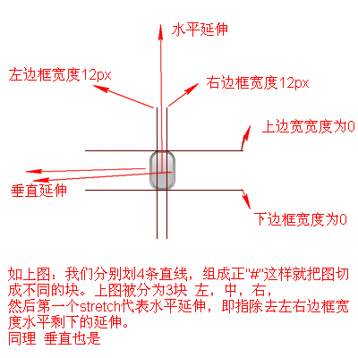
当然关于边框的宽度你也可以用%;其原理也是一样: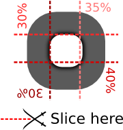
到这 大家应该弄明白border-image是怎么一回事了吧。
参考文档:
www.lrbabe.com/sdoms/borderImage
ejohn.org/blog/border-image-in-firefox